
I build a lot of animation. There are more than forty examples on my demos page — a camera that comes apart as you scroll, a chair you can recolour, a room you can look around.
So it may sound odd that the most useful thing I can tell you about animation is when not to use it. Movement is the loudest thing on a page. Used in the right place it explains something words can't. Used everywhere it hides the things customers came for — your phone number, your prices, your opening hours.
Here is how I decide, using my own demos as the examples. They are live in this article, so try them as you read.
The short version
- Animate to explain, respond or guide — never just to decorate.
- Show the product with motion when the product is the point: something people would pick up, turn over or compare in a shop.
- Keep small movements short — well under half a second.
- Nothing moves on its own for long unless people can pause it.
- Never let motion stand between a customer and what they came to do.
- Every animation needs a calm version for people who turn motion off.
What animation is actually for
The Nielsen Norman Group, which has studied how people use websites for decades, boils good interface motion down to four jobs:
- Feedback — showing the site noticed what you did.
- Change of state — showing that something switched, opened or updated.
- Finding your way — showing where something came from and where it went.
- Showing what can be touched — hinting that a thing can be clicked, dragged or swiped.
Their summary is worth quoting:
Motion is most often appropriate as a form of subtle feedback for microinteractions, rather than to induce delight or entertain users.
To those four I add one more for businesses: showing a product in a way a photo can't. That is where the big, impressive pieces earn their keep.
Where it works
Showing the product itself
If a customer would turn your product over in their hands in a shop, motion can do that on a screen.
- The exploded view pulls a camera apart as you scroll, so you can see what is inside. That is right for anything whose insides are the selling point — tools, equipment, electronics, a piece of furniture's joinery.
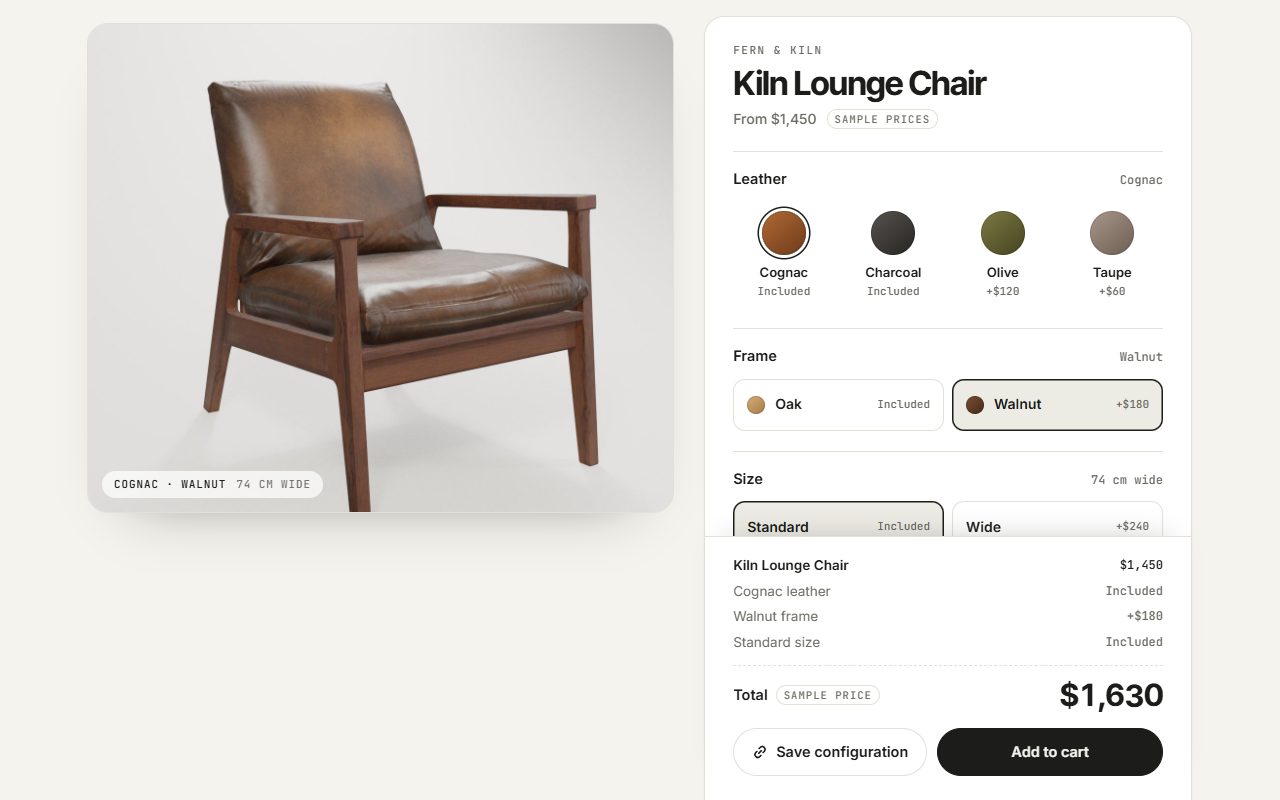
- The product configurator swaps the fabric and the frame on an armchair the moment you tap a swatch. For anything sold in options — colours, finishes, sizes — it answers "what would mine look like?" without a phone call.
- The 360° viewer lets people spin a product around. Right for things with a back and sides worth seeing.
In every case the motion is the information. Take it out and the customer knows less.
Proving a result
For trades whose work is a transformation, one comparison beats a paragraph of claims.
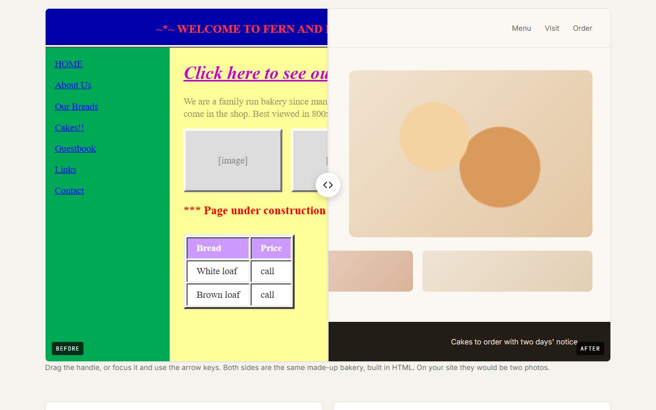
- The before / after slider lets a customer drag across a photo. For detailers, cleaners, painters, landscapers and renovators, it is the single most persuasive thing on the page.
- The 360° photo tour lets someone stand in a venue before they visit. Right for event spaces, rentals, restaurants, gyms.
Notice that the visitor is in control of both. Nothing happens until they drag.
Small feedback, everywhere
This is the kind of animation nobody notices — and everybody misses when it is gone.
- A button that responds when pressed, a form field that shows it has been filled, a menu that slides from where you tapped. The little things demo collects them.
- Tabs and an FAQ that open smoothly, so people can see which answer belongs to which question.
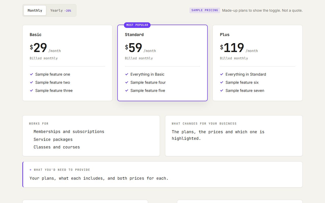
- A pricing toggle where the numbers change in place when you switch monthly to yearly — so the eye sees what changed.
- The contact form that confirms, visibly, that the message went.
The same research gives the timing: most interface animations belong between 100 and 500 milliseconds, and
At 500ms, animations start to feel like a real drag for users — they become cumbersome and annoying.
The more often something happens, the shorter it should be.
Guiding someone through a story
Some motion helps people follow a sequence.
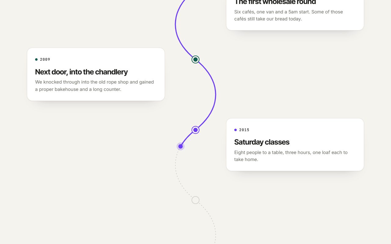
- A scroll-drawn line that traces a process — quote, visit, build, finish — as the visitor reads down.
- Chart reveals that draw a graph as it comes into view, so the eye follows the trend rather than seeing a finished picture all at once.
- A scroll story that keeps a product on screen while the text beside it explains one feature at a time.
These work when there is genuinely a sequence to follow. They are wrong for a page people want to skim.
Where it gets in the way
Anything that moves on its own and won't stop
Carousels that change slides by themselves are the classic example. Jakob Nielsen's research found people could not finish reading before the slide changed, that people with shaky hands could not click something "before it's taken away" — and, most damaging of all:
Because it moves, users automatically assume that it might be an advertisement, which makes them more likely to ignore it.
The accessibility guidelines (WCAG) go further. Anything that moves by itself for more than five seconds alongside other content must have a way to pause, stop or hide it. That is Level A — the most basic level, the one every site is expected to meet.
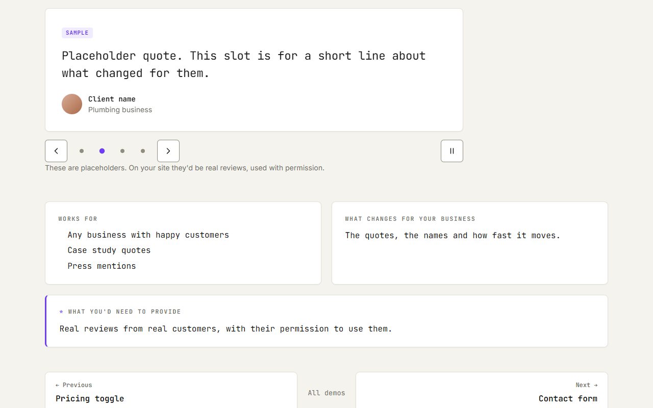
My testimonial slider does advance on its own, so it follows those rules: it stops while you hover over it or use it with a keyboard, it has a pause button, and it doesn't move at all for anyone who has asked their device for less motion. If a carousel can't do all that, it should be a plain list.
Between a customer and what they came for
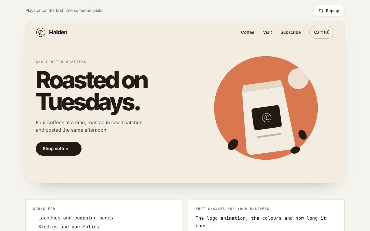
A loading intro is a lovely thing for a brand launch or a portfolio — once. On a plumber's home page it is two and a half seconds between someone with a flooded kitchen and the phone number.
The same goes for:
- Scroll-jacking — pinning the page so the visitor has to scroll through an animation to get past it. My sideways scroll and stacking cards do this on purpose, and they belong in one showcase section, never on the page someone uses to find your hours.
- Text that animates in word by word on important information. The text effects are for a headline, not for prices, policies or directions.
- Content hidden until it scrolls into view. A gentle scroll reveal is fine; content that stays invisible when a script is slow or fails is not.
Heavy motion on a slow phone
The large 3D and particle pieces — the globe, the particle morph, the reactive dot field — are heavy. Google's measure of load speed asks for the main content to appear within 2.5 seconds, and its measure of stability asks that nothing jumps around while the page loads. One big animation at the top of a home page can fail both on a mid-range phone on mobile data.
So on a real site I load these only when they come into view, never block the text on them, and move things with techniques that don't shove the rest of the page around.
Just because it's there
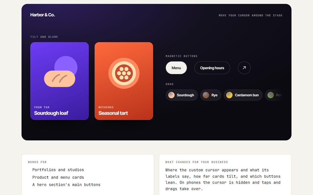
The cursor effects, image trail and liquid image hover are fun. On a photographer's or a designer's portfolio they show taste. On a dentist's site they are a distraction — and on a phone, where there is no cursor, they have to be redone as taps and drags that most visitors never discover.
A good test: if you removed it, would a customer know less, or struggle more? If not, it is decoration, and decoration should be quiet.
The people motion makes ill
Movement is not only a matter of taste. For people with vestibular disorders — problems with the inner-ear balance system — large motion on a screen can bring on real symptoms. The W3C, which writes the accessibility guidelines, describes reactions including
nausea, migraine headaches, and potentially needing bed rest to recover.
Parallax and scroll-driven zooming are common triggers. That is why every major operating system — Windows, macOS, iOS and Android — has a "reduce motion" setting, and why websites can read it.
Every demo on my site honours that setting: big movements become a simple fade or a still image, and nothing is lost. It costs almost nothing to build in from the start, and it is the difference between a site that impresses most people and one that makes some of them feel sick.
A rough guide by business
Trades, cleaners, detailers. Worth it: a before / after slider, a scroll-drawn line for your process. Skip: loading intros and sliders that play on their own.
Shops with options. Worth it: a configurator, a 360° viewer, a filterable grid. Skip: anything moving on prices or at checkout.
Venues, rentals, restaurants. Worth it: a 360° photo tour, an interactive floor plan. Skip: anything between a visitor and your hours, menu or booking.
Makers, photographers, designers. Worth it: an infinite canvas, an image trail, a liquid hover on pictures. Skip: effects that slow your photos down.
Clinics, law, finance. Worth it: small feedback and a smooth FAQ. Skip: almost everything else. Calm reads as trustworthy.
What I do
- Every animation has to do one of the jobs above — explain, respond, guide or show the product.
- The visitor is in control of the big pieces: they start when you scroll or drag, not by themselves.
- The important things — phone number, prices, hours, the booking button — are never behind an animation.
- Reduced-motion versions for everything, and heavy pieces load only when they are needed.
- I check every one on a phone, because that is where most of your customers are.
If you have seen something here and wondered whether it would suit your business, ask me. Often the honest answer is "one of these, in one place".

Comments